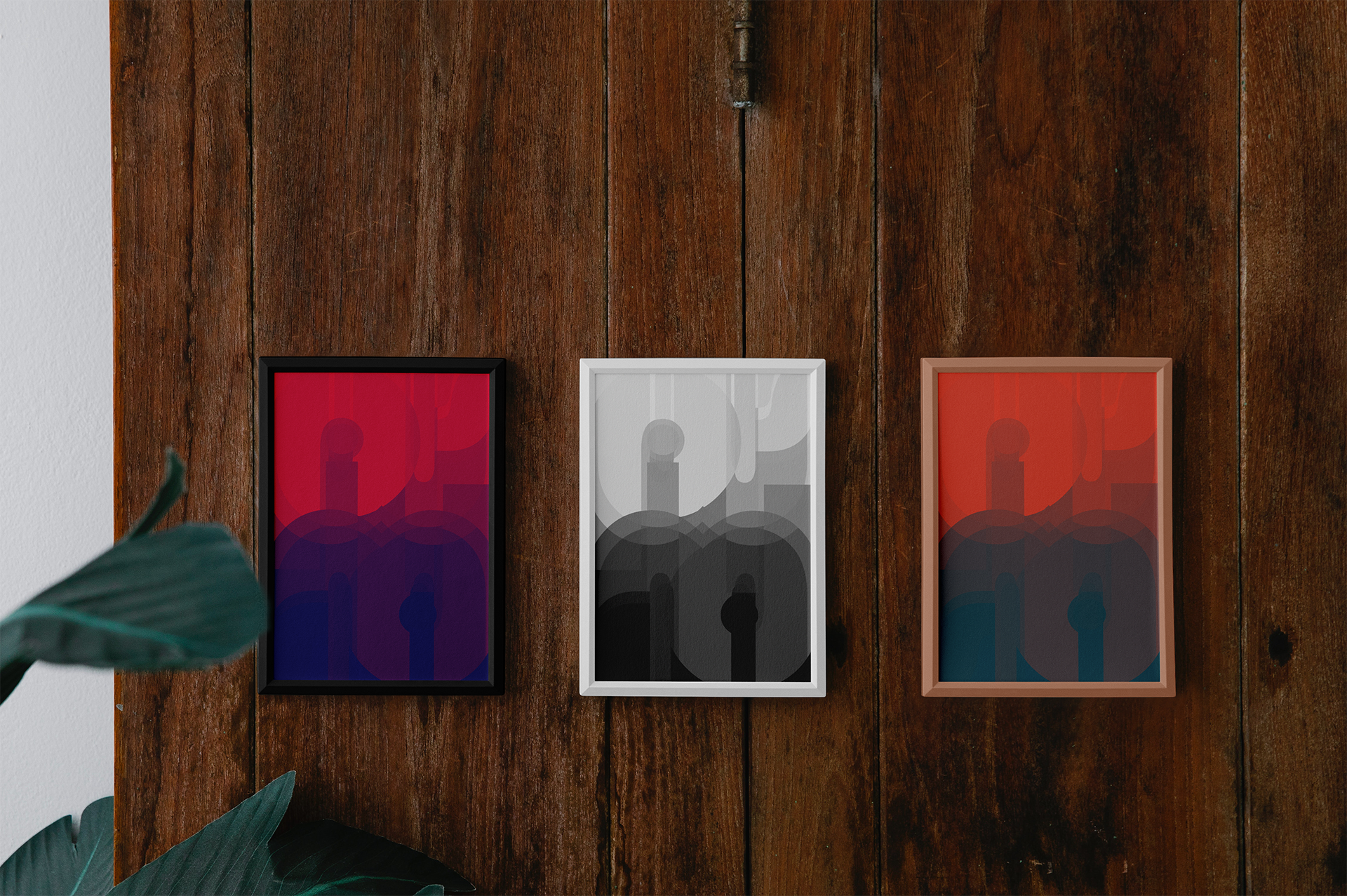
For this design I was trying to achieve a retro-futuristic look, which led me to choosing the bold yet smooth letterforms of Bauhaus 93, the chosen aesthetic getting further emphasized in the colorized versions. Though not initially intentional, the poster ended up looking reminiscent of a cityscape – I believe this is due to how balance driven my design process was during this project. I spent a lot of the project reflecting letterforms and seeing how they interacted with each other. With that in mind, I also ensured that there was a sense of unity in both the letterforms I chose and their placements. I found that the curvatures of the ‘m’ and ‘p’s aligned well and came to realize that I could draw attention to the eye of the ‘i’ by placing it in the middle of the ‘p’s. Some other letterforms I used to create a stronger sense of harmony were ‘s’s, as they look like little swirls and while layered on top of each other, creating a depth effect. Again, the driving force of this project was balance, so you’ll find that things are reflected and mirrored throughout the whole piece.
Posters


Programs